
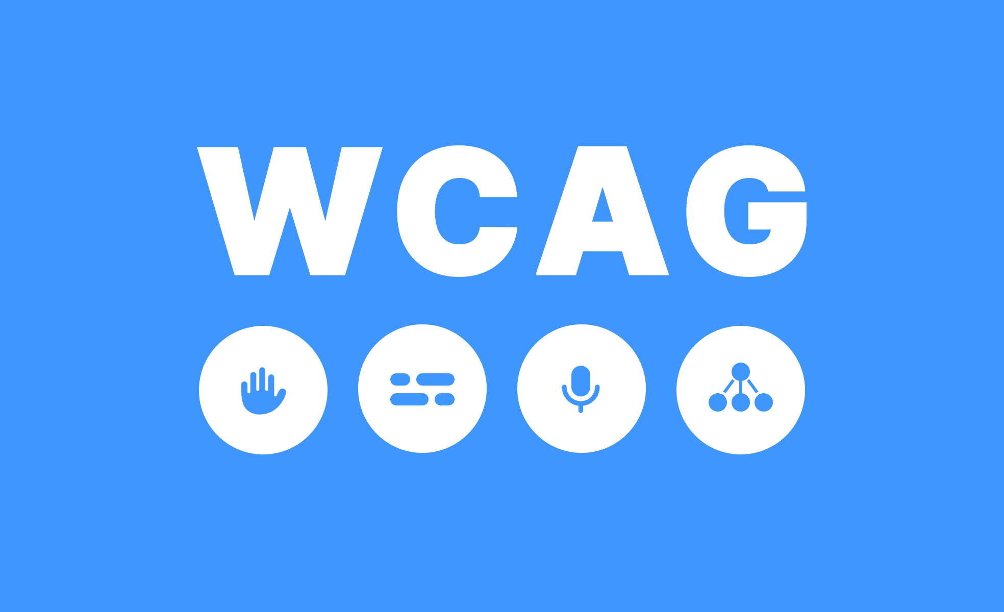
When you're designing a website or an app, you probably want it to be not only visually appealing but also useful for as many people as possible. And that’s where WCAG comes in — the Web Content Accessibility Guidelines, a set of rules that help make digital content accessible. Sounds a bit technical? Don’t worry — I’ll walk you through each step briefly.
WCAG is a set of guidelines that help us design content and interfaces in a way that makes them accessible to everyone — not just people without health issues, but also those with various disabilities. That includes users with visual or hearing impairments, people who rely on screen readers or simply older adults who may have trouble clicking precisely.
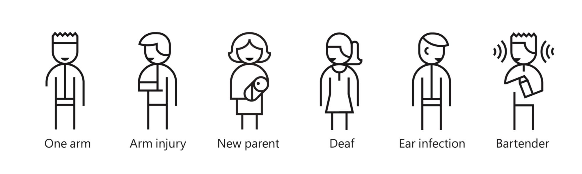
In a perfect world, we’d design for absolutely everyone. But reality can be a bit harsh — there are budget limits, time constraints, and business priorities. Sometimes, you have to focus on the majority of users instead of edge cases. That doesn’t mean people with disabilities don’t matter — it’s about striking a conscious balance. Designing a public banking app is one thing, but creating an internal company tool (where you know there are no users with disabilities) is a completely different scenario.
There's no point in having beautiful text or images if someone simply can’t see them. Make sure your content is both visible and understandable.
Examples? Add alternative text to images so screen readers can "read" them. Or ensure there's enough contrast between text and background — don’t go with white on light yellow, that’s just not cool.
And one more thing — don’t try to cram everything onto the screen at once. A layout that looks like a cluttered office corkboard is a fast track to overwhelming your users. Giving elements some breathing room, grouping information logically, and using empty space (white space) really makes a difference. That’s part of accessibility too — making sure the interface isn’t tiring or overwhelming. You don’t need to dive deep into cognitive load theory, but it’s good to keep it in the back of your mind.
Your website needs to be operable not just with a mouse, but also with a keyboard. Many people with different limitations rely solely on the keyboard or assistive devices. That means buttons and links should be easy to “activate” without using a cursor. Avoid automatic elements that, for example, change on their own after a few seconds and create chaos — that can be seriously frustrating for users.
Not everyone is a master of reading between the lines — and screen readers definitely aren’t. Clear language, straightforward messages, logical structure, and predictable element behavior are key. Who wants to deal with a confusing manual or navigation that changes every time you click something?
This one’s a bit technical, but not too much — it’s about making sure your designs work properly across different devices and are compatible with assistive technologies like screen readers.
You don’t have to write code yourself, but a well-designed interface makes it easier for developers to implement accessible solutions.
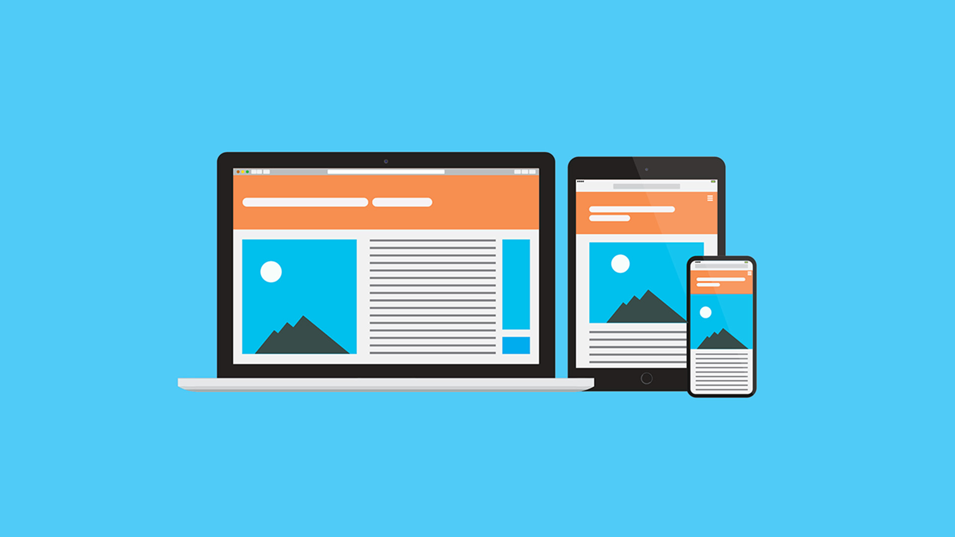
It’s also important to remember responsiveness and scalability — meaning the layout should behave well both on a large monitor and on a small phone or tablet screen. Elements should adjust smoothly, not overlap, and text should stay readable no matter the screen size or zoom level.
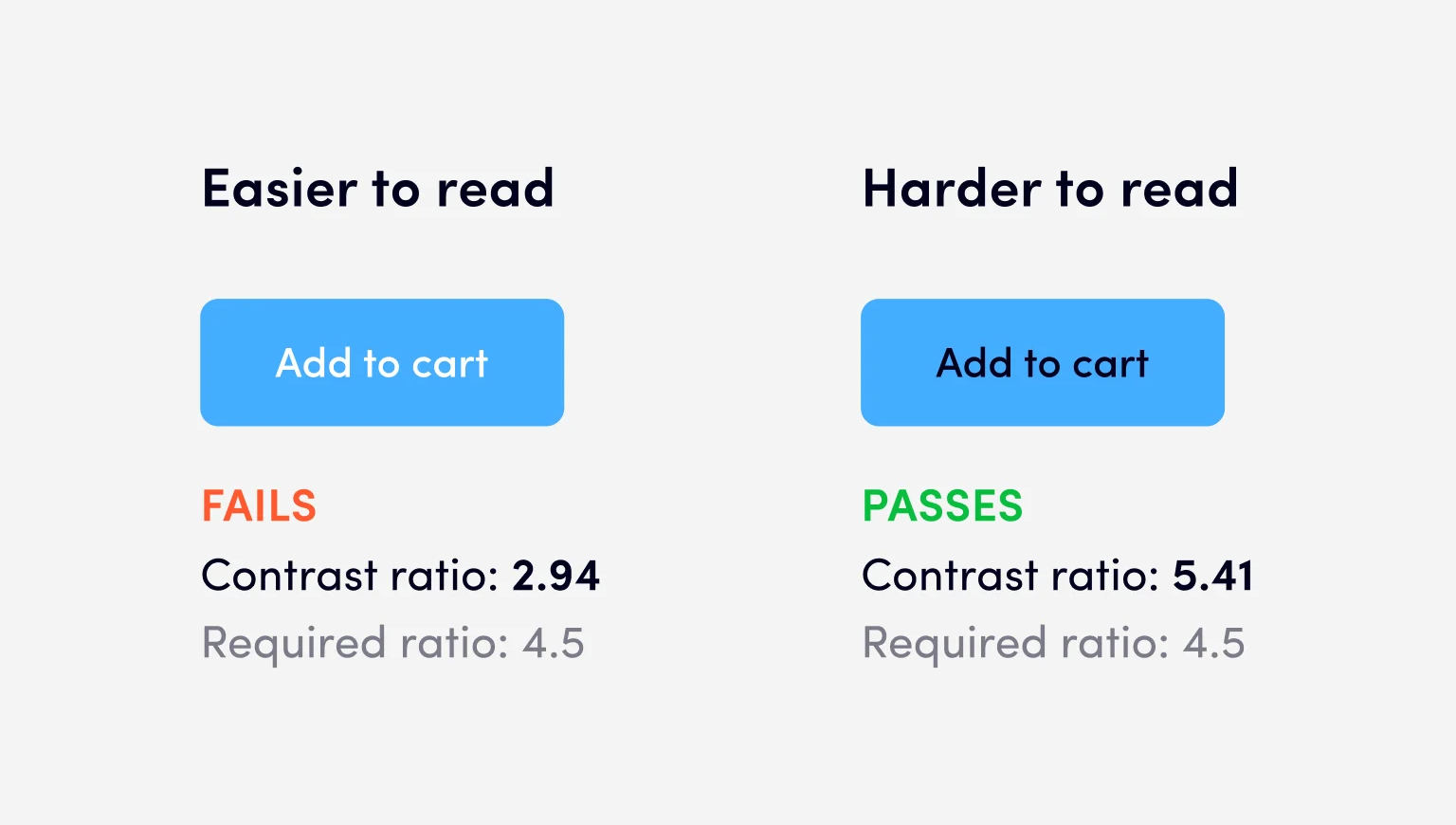
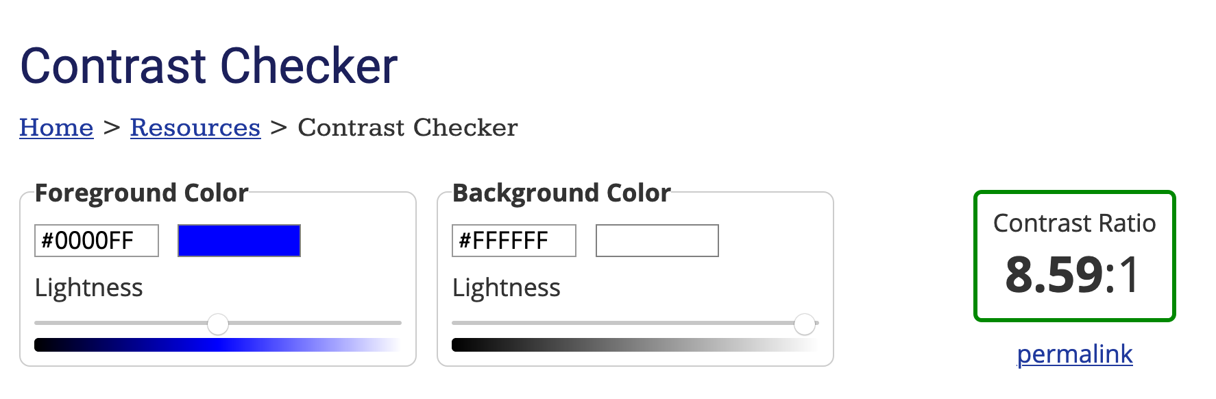
Colors aren’t just about aesthetics. For many people with visual impairments, they can literally make or break the experience. Make sure there’s enough contrast, use color intentionally and don’t rely on color alone to communicate important information. For example, an error message shouldn’t be only red — add an icon or explanatory text as well.
The recommended minimum contrast ratio is 4.5:1 for regular text and 3:1 for large text (for example headings above 18px in bold or 24px in regular weight).
Here’s a handy tool to check contrast yourself: Contrast Checker
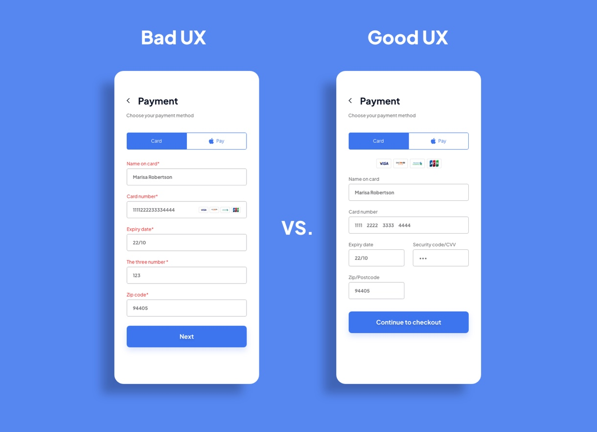
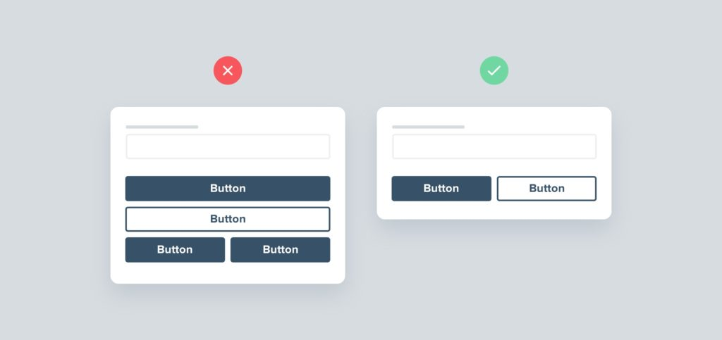
Forms are often a source of frustration for users. Labels need to be clear and properly linked to their input fields, hints should be easy to understand, and error messages must be visible and meaningful. A good form doesn’t make the user guess what to do next.
If the form is long or complex — don’t be afraid to break it down into steps. This kind of approach (known as a form wizard) can not only improve the overall UX but also reduce user frustration. Just make sure the step-by-step navigation is well thought out and intuitive.
Don’t forget about people who are deaf or hard of hearing — captions are the bare minimum for videos. If you’re working with longer recordings, providing transcripts or audio descriptions for blind or visually impaired users is a great addition.
It’s not enough for something to just look good and “seem” accessible. It’s worth using accessibility testing tools (like Wave), but also… asking real users for feedback. Testing is the key to success.
Finally — remember that accessibility isn’t something you do once and forget about. It’s an ongoing process that requires attention at every stage — from design, through development, all the way to testing and updates.
WCAG isn’t a scary monster — it’s a set of guidelines that make your UI/UX friendly for everyone. You don’t need to know all the technical jargon to start making improvements — just a few good habits and some care for diverse users.
And if you’re not sure whether you need to design for full accessibility, ask yourself first: “Who is this product for?” Because sometimes, reasonable accessibility is enough — you don’t always have to aim for encyclopedic perfection.
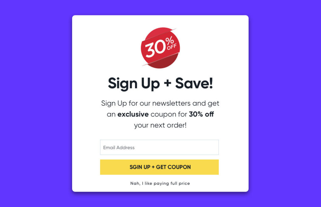
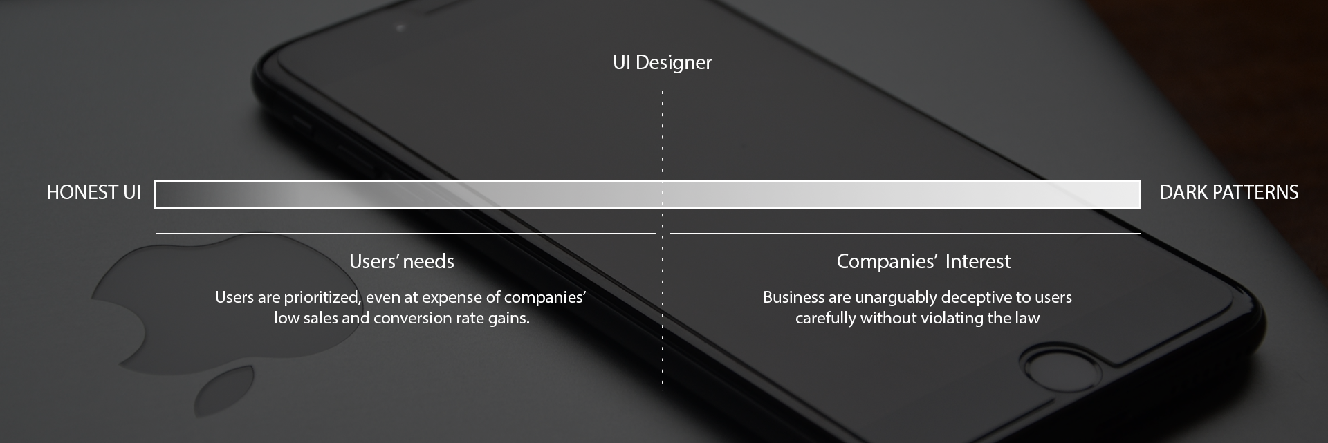
Dark patterns are UX design tricks that intentionally mislead users. They’re effective, sure — but are they fair? And what do you do when marketing says, “We need more conversions, no matter what”? Exactly.
Dark patterns are UI/UX elements that are deliberately crafted to nudge, trick, or push users into actions they probably wouldn’t take if given a truly neutral choice — like subscribing, buying something, or accepting all cookies with a single misclick. It looks like UX, but there's a bit of psychological bait in there.
Simple answer: they work. Dark patterns can lead to:
Some companies like Amazon, Booking, LinkedIn have practically mastered this. Want to cancel your Prime membership? Good luck finding that tiny gray text on the third page of the settings menu.
As a designer, you’re often caught in the middle. On one side: ethics, best practices, user respect. On the other: pressure from marketing, tight deadlines, and A/B tests showing that shady stuff works faster.
💬 Real-life example: “Can you make the ‘Accept All’ button look more clickable? People aren’t consenting enough.
Is it ethical? No.
Do you always have a choice? Not really.
In these cases, ask yourself:
Not every dark pattern is pure evil. Some live in the gray zone and can actually help — like reminding a user about an abandoned cart or encouraging a signup with a bit of FOMO (Fear of Missing Out).
But when you start to:
…you’re no longer designing for people — you’re designing against them.
With GDPR, the Digital Services Act and FTC action dark patterns are no longer just shady — they’re becoming legally risky. Better to prepare your UX before a lawyer does.
Instead of manipulation – go for honest UX:
Good design still converts. It might take more effort — but it builds loyalty, trust and legal peace of mind.
Dark patterns are like knives — you can slice bread or you can rob someone. Know them so you can:
In the end, it’s you, your conscience and a dashboard full of metrics.

Before you break something — you need to understand what exactly you're breaking. In UI/UX, structure means:
It’s like in architecture: before you design a building with tilted windows, you need to understand how the structure works. In design, structure is your static foundation — without it, everything falls apart.
Many designers work on autopilot — a dashboard looks like a dashboard, a list like a list, a modal like a modal. But the user… has seen it all before.
Structure Breaking Ability is the skill of:
Breaking structure doesn’t mean chaos. It’s a way to create something that is:
A complex interface doesn’t have to feel heavy. A simple one doesn’t have to be boring.
What matters is to:
🔸 White space isn’t background – it’s a structural element of the layout.
Too little: chaos. Too much: emptiness.
🔸 Think of your interface like furniture in a room — it should feel spacious, yet functional.
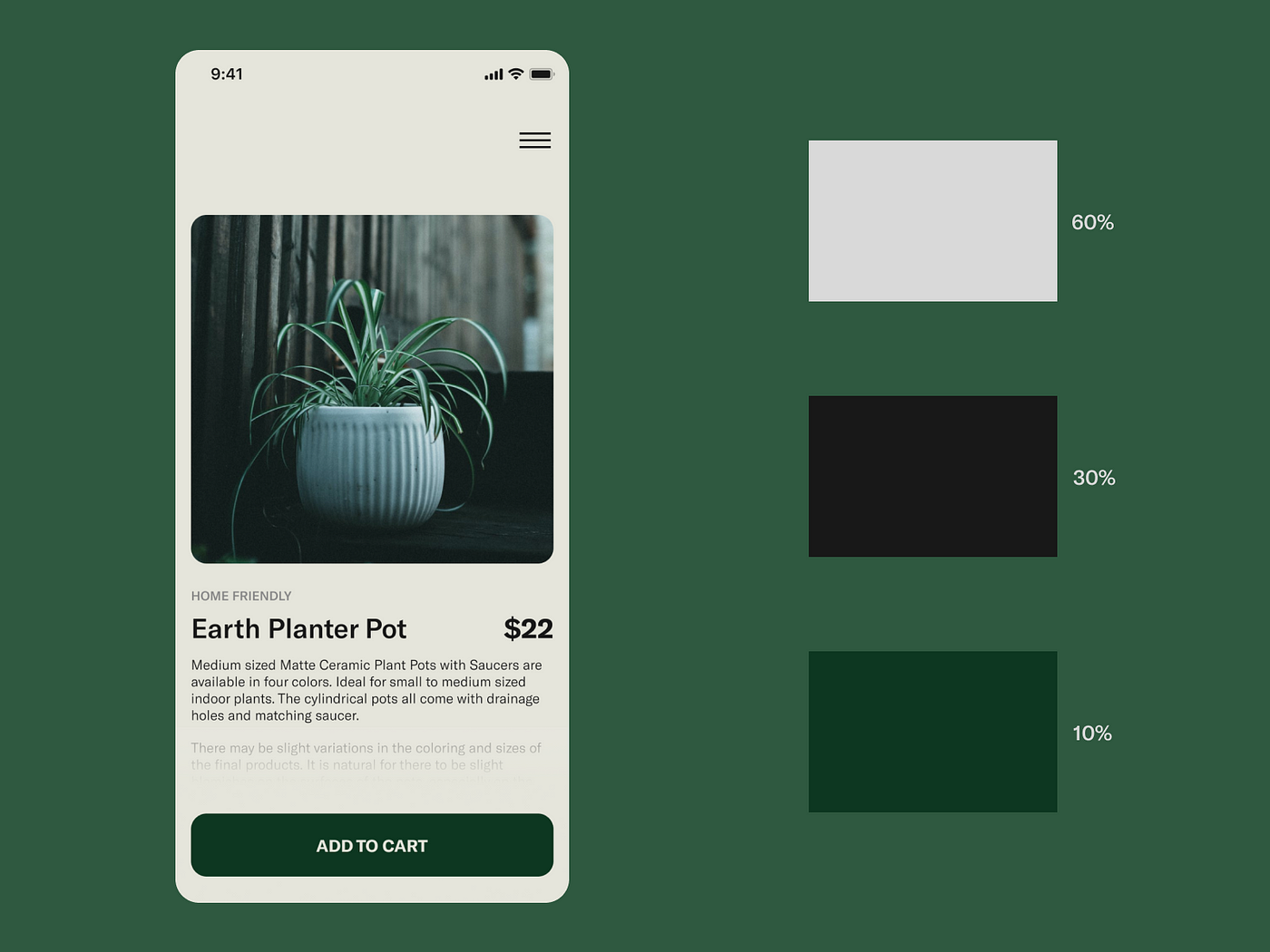
Color is one of the most powerful tools for breaking patterns. But without control, it’s easy to go overboard.
🟢 60% – dominant color (e.g. background, main sections)
🟡 30% – supporting color (e.g. cards, secondary CTAs)
🔴 10% – accent color (e.g. buttons, alerts, interactions)
The 60–30–10 rule helps create both cohesion and contrast — without excess.
Breaking structure isn’t just about layout — it also means:
When designing a complex interface:
This is where breaking structure pays off the most.
The user feels the interface is alive, adaptive — not boring.
Some areas require predictability:
In these cases, classic structure works best.
But even here, you can introduce micro-elements that add personality — like animation, icons, copy, or color.
Many interfaces are created based on a "feeling" — they work, look okay and no one complains. But conscious design is something more:
🔍 It’s not about every pixel being justified — but about every element being part of a bigger puzzle.
You don’t have to break the entire layout right away. Sometimes it’s enough to:
These little things break predictability without breaking usability rules.
In large-scale products, this is one of the most important — and often overlooked — aspects of design.
Features need to be arranged in a way that maintains clarity and order, even within limited space. A dense layout works well where efficiency and quick access are key, while a more airy layout supports focus and gives the eyes room to rest.
Spatial hierarchy should guide the eye: from headings, through supporting information, down to actions.
This is where design stops being decoration — and becomes a tool for organizing complexity and supporting navigation.
Good structures are like springs — you can stretch them, bend them, twist them… but they return to form.
That’s why breaking patterns is worth it. If your foundation is solid, the interface won’t fall apart.
💬 First learn the rules, then break them like an artist. – Pablo Picasso
Designing a product that “has potential”, but somehow just doesn’t click? Users get confused, internal collaboration feels clunky and your interface looks like a Frankenstein of features?
Here are the top UI/UX traps product teams fall into — even experienced ones.
🧩 The problem: Designers are brought in only after features are scoped and business decisions made.
💣 The result: UX becomes surface-level. No user flow, no context, no strategy.
✅ Fix it: Include designers early — during discovery, ideation and priority setting
(design is not just about appearance – it's also about information architecture, flow and user needs).

🔌 The problem: Lack of collaboration between designers, developers and PMs. Everyone does their own thing and the final product is a collection of inconsistent compromises.
⚠️ The result: Conflicts, delays, mismatched expectations, last-minute redesigns.
✅ Fix it:
👀 The problem: UX decisions are based on team intuition ("I think it works") instead of research or user testing.
💀 The result: Low conversion, abandoned forms and support overwhelmed with questions.
✅ Fix it:
📦 The problem: Trying to deliver as many features as possible at once — often "just in case."
🥴 The result: Overloaded interface, lack of focus, confusing navigation. The user doesn’t know where to start.
✅ Fix it:
🎨 The problem: No shared component library, consistent style rules or interaction patterns.
🧩 The result: Every screen looks different, elements behave inconsistently and the overall brand identity gets lost.
✅ Fix it:
♿ The problem: Designing without considering the needs of people with disabilities — low contrast, small fonts, no keyboard support.
🚨 The result: User exclusion, legal risks, lower conversion rates and loss of trust.
✅ Fix it:

When I tell people that I work as a Product Designer, I often hear: "Oh, so you're the one who makes all those pretty screens?" And while it's true that I spend a fair amount of time in Figma, aesthetics are just the tip of the iceberg. The real work starts much earlier and goes much deeper than just colors and grids.
On a daily basis, I'm involved in conversations, decisions, compromises and competing interests that aren’t always visible from the outside. That’s exactly what I want to talk about – what really happens behind the scenes of a product designer’s work.
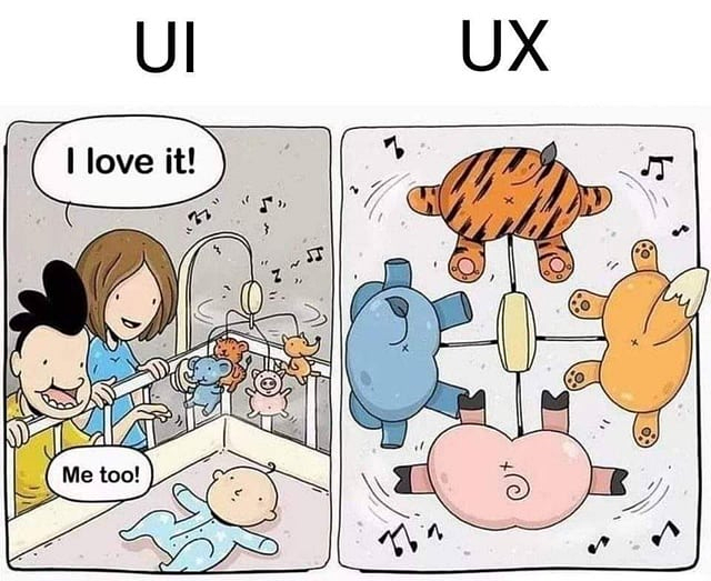
Many people wonder about the difference between UI and UX and how Product Design fits into the picture. Think of it like a car — UI is the body, color and cockpit design, UX is how smoothly and comfortably it drives and Product Design is the entire concept of the car — from the initial idea, through testing, to final implementation and support.
For me, a Product Designer is primarily a bridge between the user, the business and technology. Often, I have to act like a researcher, talking to customers and observing how they use the product. Other times, I work like a Project Manager, keeping track of deadlines and priorities. Sometimes I’m like a psychologist, trying to understand users’ motivations and emotions.
“Perfect is the enemy of done” — a saying I know all too well. At times, I have to accept that a product won’t be perfect at launch. But I also know that design debt is real — the small compromises that pile up over time and hurt the overall user experience.
I occasionally make small compromises in visual details or animations to ship faster. But I never compromise on what’s critical for the user — like accessibility or a clear, intuitive flow.
One example: I pushed back on removing a loading indicator that some saw as “just a spinner.” But to me, it was a key signal to the user that the system was working.
I make decisions at the intersection of data, intuition, user insights and team input. Sometimes I have the full picture — solid research, analytics and test results — and everything aligns clearly. But just as often, I have to move forward with incomplete information and make confident choices despite the gaps.
In those cases, I rely on quick validation methods such as building prototypes, simplified versions of features (like clickable UIs without real functionality), or running quick internal tests. This helps me gather early feedback before committing to full implementation — and reduces the risk of designing in the dark.

Research is the foundation of a good project — without understanding users, it’s easy to design “in a vacuum.” I use both qualitative methods (interviews, observations, in-depth conversations, usability testing) and quantitative methods (surveys, data analysis, A/B testing).
When I run qualitative research, I usually prepare a scenario with questions and goals I want to check. But I don’t always stick to it rigidly — conversations often take an unexpected turn and that’s when the most interesting insights come up.
I treat quantitative research as a complement: it gives me numbers, trends and the scale of behaviors, which helps me see what’s really happening. I often combine both approaches — data shows the “what,” while talking to users helps uncover the “why.”
Before I start designing, I always run a competitive audit — a review of similar products and UX patterns.
It’s not about copying — it’s about learning what works and what doesn’t. Still, I sometimes see teams blindly following trends, even when they don’t fit their users.
UX patterns are a bit like road signs — they help users find their way, but only if they fit the context. In the wrong place, they can confuse or slow people down instead of helping them.
Not every feature needs to be built from scratch. It’s tempting to create something “fresh” but when every element looks and behaves differently, users get confused — and the team wastes time.
That’s why I’m a strong believer in a systematic approach. It’s not just about having a UI kit in Figma — it’s about thinking in patterns. When I design a new modal, I ask: do we already have something similar? Can I extend what’s already in the system?
There was a time when someone created a custom profile card just because it “felt right.” The result? Three different card styles, poor scalability and frustrated users. Experiences like that are why I keep a close eye on the Design System — because design chaos costs more than it seems.
Being the only designer on a team isn’t rare. In those moments, I’ve had to take on a leadership role, even without the word “lead” in my title.
It’s about making decisions, keeping things consistent and setting standards the team can rely on. I often become the point of reference — the person others come to with questions about interactions, patterns or design principles. And when there’s no process or documentation yet, I create it. Sometimes I’m not just designing for users but for the team itself — building tools, guides and systems that help us work faster, more clearly and more cohesively.
Mentoring is part of that role too. I’ve had opportunities to support less experienced designers — showing how to approach research, how to communicate with stakeholders and how to stand by their ideas. Not from a place of authority but of partnership.
The perfect project? It doesn’t exist. There’s always something missing: data, time or context. I work in sprints, so I often create iterative solutions. First a sketch, then a quick prototype, feedback, adjustments, testing and only then a high-fidelity design.
Everyday life also includes meetings, unclear briefs and last-minute priority changes. You have to learn to be flexible without being chaotic. To keep structure in your mind, even when everything around you feels like chaos.
Leadership often views things through the lens of ROI, KPIs and the roadmap. Sometimes, they push for quick wins or changes that — from a user’s perspective — might feel unintuitive. In such cases, I try to explain the long-term consequences. Will the solution genuinely improve the user experience? Or does it just look good in a pitch deck?
In one project for a financial platform, I was redesigning a key dashboard. The existing version didn’t require scrolling (mostly) — everything was visible at once. Some long-time users strongly preferred it that way and resisted the idea of a scrollable layout, even though it's now the standard in the industry and used by financial competitors. They were simply used to the old structure. Instead of forcing the change, I gathered feedback, ran usability tests and demonstrated how the new design improves clarity, scalability, and mobile compatibility. Over time, we were able to shift the perception — not by dictating, but by showing the value of the new approach.
For me, analysts are not just “data providers.” They’re partners in identifying patterns and understanding user behavior. Sometimes intuition suggests one thing, but the data tells a different story. That’s why before I redesign anything, I always check: where users click, where they get lost and when they drop off.
Analysts also help define key requirements — both technical (e.g. based on what we can pull from the existing system) and functional, related to the scope of the task or the definition of done (e.g. in Jira). Without their input, it’s easy to miss limitations or edge cases.
One of the more interesting cases involved a credit application form, where we noticed a sharp drop-off at a specific step. Users were abandoning the process when asked to upload a document — which as it turned out, was completely optional, but this wasn’t clearly communicated. After updating the copy and clearly indicating that the step could be skipped, the form completion rate increased by over 30%.
Good communication with developers is fundamental. I always talk to them before diving into design details. I discuss the solution itself, propose ideas, and ask: Is this approach feasible? Can we build an MVP first and then expand?
While I strive to maintain good contact with every developer on the team, I work especially closely with frontend developers because they are the ones who “bring my designs to life.” As a designer, it’s important to me that the final result matches the design as closely as possible (ideally 1:1) because that way I can take responsibility for what I designed. If changes are made along the way without my involvement, the responsibility becomes unclear — and I want to avoid that.
I also have a background in Computer Science and at one point planned to become a frontend developer, which today greatly helps me communicate effectively with the technical team. I understand technical limitations, can anticipate what’s achievable within a given framework and often communicate in terms familiar to developers. Thanks to this, collaboration flows smoothly and in negotiations I’m often able to find solutions that benefit both UX (mostly😊) and implementation.
QA specialists are often the last people to see the product before it goes live. I share scenarios, edge cases and explain why certain things work the way they do. As a result, testing becomes more focused and the feedback I receive is much more accurate.
Although I also test new releases myself across different test environments, I always encourage testers to look beyond the flow. I ask them to pay attention to how the UI scales, whether the interface matches the designs and to spot any visual inconsistencies. I might miss something — and that extra layer of attention is truly valuable before anything reaches the end user.
A QA tester once mentioned that the tools I shared — like the Dimensions browser extension (for checking spacing in the UI) and some tips for using the "Inspect Element" (F12) feature more effectively — really helped them catch small inconsistencies between the implementation and the design. They also said that seeing how much I cared about those “little details” on my end made them more motivated to be equally thorough — because it showed that I genuinely cared about the final quality.
I work very closely with the Product Manager — not just as a partner, but also because the PM often makes key decisions that have a real impact on the product’s direction. That’s why I make sure to stay involved and actively participate in discussions, so I can contribute my UX/UI perspective and influence those decisions as early as possible.
We talk about what’s most important, the dependencies and what can be released as an MVP. When the PM wants to push something out quickly, I check if it can be done without compromising UX. And when I want to refine something, the PM and I work together to find time for it within the sprint. It’s a daily balance that requires mutual understanding.
There have been times when we had to change the scope or approach — because something was too costly, for example. But it’s also happened the other way around: my prototype impressed the management so much that they fast-tracked its implementation.
Design doesn’t stop at the app.
I work with the marketing team because they often shape how our product speaks to users — through messaging, emails, newsletters or the promoting website.
Sometimes we sit down together and break a message apart: What exactly do we want to say? Who are we talking to? In what tone? These conversations help me choose the right words in the UI, but also ensure consistency between what the users see on the promoting page and how the product communicates with them once they start using it.
I remember a situation where simply changing a headline on the website increased CTR by 30%. Another time, all it took was adjusting the illustration style to make the whole experience feel more cohesive and professional.
Newsletters and onboarding flows are great examples of where product and marketing meet directly. If a user sees a clear, friendly message on the site but then lands in a cold, overly formal onboarding — something feels off. I make sure the voice stays consistent, thoughtful and engaging from discovering the product to actively navigating through it.
Collaborating with marketing also gives me valuable insight into how customers think and talk about our product — and that’s essential for designing experiences that actually resonate.
What I consider a final design today might become version 1.1 tomorrow — and that’s OK. Iteration isn’t a failure. It’s a natural part of a product’s life cycle.
After each release, I analyze data, gather feedback and observe how people actually use the feature. Sometimes, something that performed great in testing turns out to be less effective in the real world. When that happens, I go back and rethink the solution — without ego, with humility.
Once, I was designing a filtering system — after a month of usage, we realized most users didn’t understand the difference between “sort” and “filter.” We changed the interface and the copy. It worked. And that’s exactly why iteration isn’t about fixing mistakes — it’s part of the process.
What happens behind the scenes in my work is a daily balancing act between quality and time, empathy and business goals, vision and technical realities. But that’s exactly what I enjoy the most. Every successful implementation, every positive user feedback, every moment when the team starts to understand that design is not just about aesthetics — that’s what brings me the greatest satisfaction.
At the end of the day, design isn’t just what you see — it’s everything that happens before and after you see it.
AI is being talked about everywhere these days. Tools like DALL·E, MidJourney, Adobe Firefly or ChatGPT are increasingly making their way into designers' workflows. Suddenly, things that used to take hours of work in Figma or Illustrator can now be generated... with a single prompt.
For many, it sounded like a revolution. For others — a threat. I had my doubts at first too. But what’s the reality?
In the media and various reports, experts have warned about the potential loss of creative roles. For example, Dario Amodei (CEO of Anthropic) predicted that 20–50% of office-based jobs could disappear within five years starting from 2025
(source).
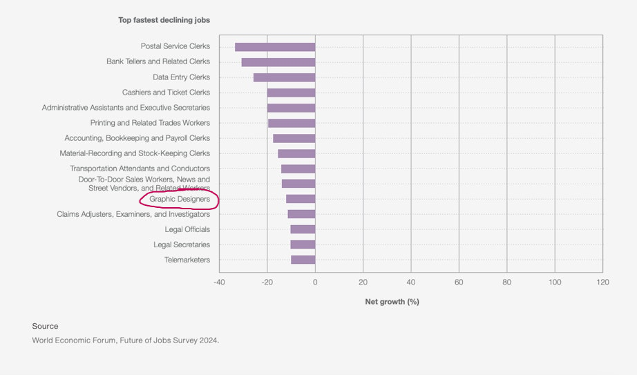
The World Economic Forum identified graphic design as one of the 11 fastest-declining professions between 2025 and 2030. Superside also estimates that up to 41% of graphic designers may be at risk
(source).
Across many workplaces, there was a strong sense that AI would revolutionize the job market — but will it really be in a destructive way?
After a few years of using AI in everyday work, we're starting to see the true picture. And it’s not as black and white as it may have seemed.
📉 Yes, some tasks are being automated. But...
📈 At the same time, AI helps us work faster, smarter — and often better.
An example? IBM shortened its campaign design process from two weeks... to just two days
(source). The team still does the same work, only faster and with less stress.
What’s more, up to 83% of artists say they regularly use AI in their work (source). Research also shows that AI tends to complement rather than replace humans — enhancing efficiency while people remain in control of the creative direction.

👉 Faster prototyping and iteration – saving time and energy.
👉 Automation of routine tasks – format changes, cropping, multilingual versions.
👉 Inspiration – generating ideas and visual directions.
👉 Personalization and scaling – mass-producing visuals tailored to the audience.
👉 Greater accessibility – tools available to everyone, not just professionals.
AI is a powerful tool, but still… it’s just a tool.
That’s why it’s so important to treat AI as a support, not a replacement.
More and more, we’re hearing that the future of design is about collaborating with AI, not fighting it.
🧠 Designers are becoming more like conductors than just “hands on the keyboard.” They can focus on refining ideas, overseeing projects and adding emotional and strategic value.
💡 Skills like creative and critical thinking, design ethics, tool literacy and the ability to write strong prompts are becoming increasingly important
(source).
🚀 Design roles themselves are evolving — areas like UX, AI design and content curation are growing, not disappearing
(source).
Now is a great time to grow, explore new digital possibilities and leave fear behind.
AI in design is not the end of creativity — it’s a new chapter.
✅ It helps you work faster.
✅ It simplifies routine tasks.
✅ It frees up more time for what really matters: concept, message, emotions.
But it doesn’t replace the human. Because you as a designer, illustrator, creator, know what works. You have the intuition, experience and sensibility that can’t be coded.
A Design System is something that in the product world sounds like the holy grail.
Everyone wants one, everyone talks about it, everyone showcases their component library on slides.
But… it’s not always sunshine and rainbows. Sometimes what was meant to help can actually get in the way.
In this piece, I’d like to show both sides of the coin:
🟢 when a design system is a blessing
🔴 and when it can become a ball and chain
Let’s be honest – a well-functioning Design System is pure gold.
There are plenty of benefits:
And here comes the other side: Design System Mania.
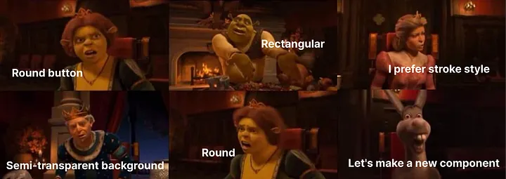
I once took part in a project where the Design System was the very first thing we built before even a single screen existed. It sounded great. Until after three weeks, the strategy, team and roadmap all changed… and it turned out that 90% of the components had to be thrown away or rewritten.
The result?
I often hear: “We’re starting a new product – so let’s build the system first.”
But in many cases, that’s a mistake.
In the beginning, many things change: screens, flows, requirements, priorities.
If we try to finalize the components too early, we will almost certainly have to redraw them again and again.
That’s why I support the approach:
🟡 First chaos – then system.
Let’s not be afraid to start with a rough draft. Chaos (small, in the early-stage) often sparks brainstorming sessions, leading to more informed and effective decisions.
A Design System makes sense when we already know:
Here are some signs that the time has come:
✅ You notice that certain elements start appearing repeatedly, often in very similar forms — meaning repetition is increasing.
✅ Developers begin creating their own unofficial versions of the same components because there isn’t a single, consistent version to use.
✅ Each screen has a slightly different look and behavior, which starts to bother the team.
✅ The development pace slows down because instead of using ready-made solutions, components have to be designed and implemented from scratch every time.
In one of my projects, we deliberately postponed building the Design System.
At the beginning, everything was changing — mockups, objectives, even the business model. Building the system then would have been a waste of time.
Only when we started repeating the same patterns and everyone was doing them “their own way” did a real need arise — that’s when we sat down and organized what was already working.
Thanks to that, the Design System became a solution to a problem, not an extra burden. And that’s when it worked best.
In my opinion, the key is iterativeness.
Start with things that already work — don’t force it.
You can:
And above all: close collaboration with the development team is crucial — especially when it comes to choosing and developing the framework or UI library that the Design System is based on. It’s important that everyone understands what we’re building on and what decisions we’re making, as this makes implementation and further development easier. A Design System is a joint effort, not a one-sided tool imposed from above.
A Design System isn’t a religion. It doesn’t have to be perfect. It doesn’t have to be complete. It doesn’t need 500 components and a 100-page documentation.
💡 It’s better to have a small, living system than a massive, dead one.
I’ve seen Design Systems that looked impressive… but no one really used more than ⅓ of what they were capable of — or ones where 80% of the documentation was outdated after just three months.